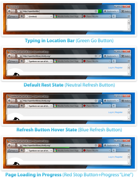
Firefox 4 might end up having a new user interface according to these mockups.
Mockup A – Tabs-on-Bottom
Apart from having the cool but non-essential aero glassy transparent effect (introduced in Vista) appearing at firefox’s top section (title bar, file menu and tabs), I can’t see much of a difference compared to what we already have in firefox 3. Do you?

Mockup B – Tabs On Top

This looks so much better as it gets rid of the file menu and saves some space meaning more screen space to show your content. People who are already using Google Chrome will find this mockup very similar to the Chrome browser user interface.
[via mozilla wiki]
Leave a Reply